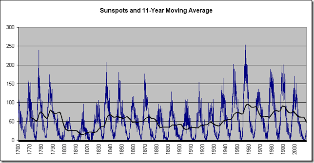
Data monthly on sunspots is available from NASA here. The history of the Dow Jones Industrial average can be downloaded from finance.yahoo.com. The chart below shows the sunspot cycle and and rolling 66 month price-only returns to the Dow, representing half of the approximately 11 year length of the solar cycle. The trend lines are both over 132 months, the length of the solar cycle.
It is evident that there is some correlation with the solar cycle appearing to lead (I’m sorry, I’m just having fun). The biggest 5.5 year blow off was in 1987, with the secondary blow off occurring in 2000. Sunspot activity has been very low recently, although the next cycle is poised to peak in 2012 or 2013. This site provides some interesting historical correlations. Charles Nenner believes the cycle, along with other factors, forecasts a major war beginning in about 2013 (link), and a Dow going to 5000 in the next several years.
What is supportive of the hypothesis of a major slowdown of human activity in general (“the change”) in the future, however, is the NASA forecast for the next solar cycle, which is very, very low.
Source: NASA
The climate of the early nineteenth century was notably cool (source), with the winter of 1810 being described as “arctic.” The winters of 2032 and succeeding ones might be similar if it takes a low cycle to really cool off. Or, at least, global warming might be mitigated.


No comments:
Post a Comment